A single misconfigured access policy can bring an entire organization's network down.
This is what it feels like to design for the people responsible for preventing that.
Mission
Fungible.
Mission Fungible was the design team's explicit rejection of siloed ownership. Every designer develops a working mental model of the entire product, not just their assigned area. Any designer can contribute to any module without a long ramp-up.
The result is a specific habit of thinking: before committing to any design decision, ask what it touches. An alert policy affects what an engineer sees during a live incident. A licensing expiry gates features in Inventory. None of it is isolated. All of it is connected.
Six Ways of Seeing
the Same Network
How do you make six fundamentally different views feel like one coherent tool?
Visualize — Network Topology Module
A network engineer doesn't experience their infrastructure as a single picture. They experience it through six simultaneous lenses, each answering a different question. Designing for this meant building one tool that could hold all six realities at once.
The ProblemGeographical
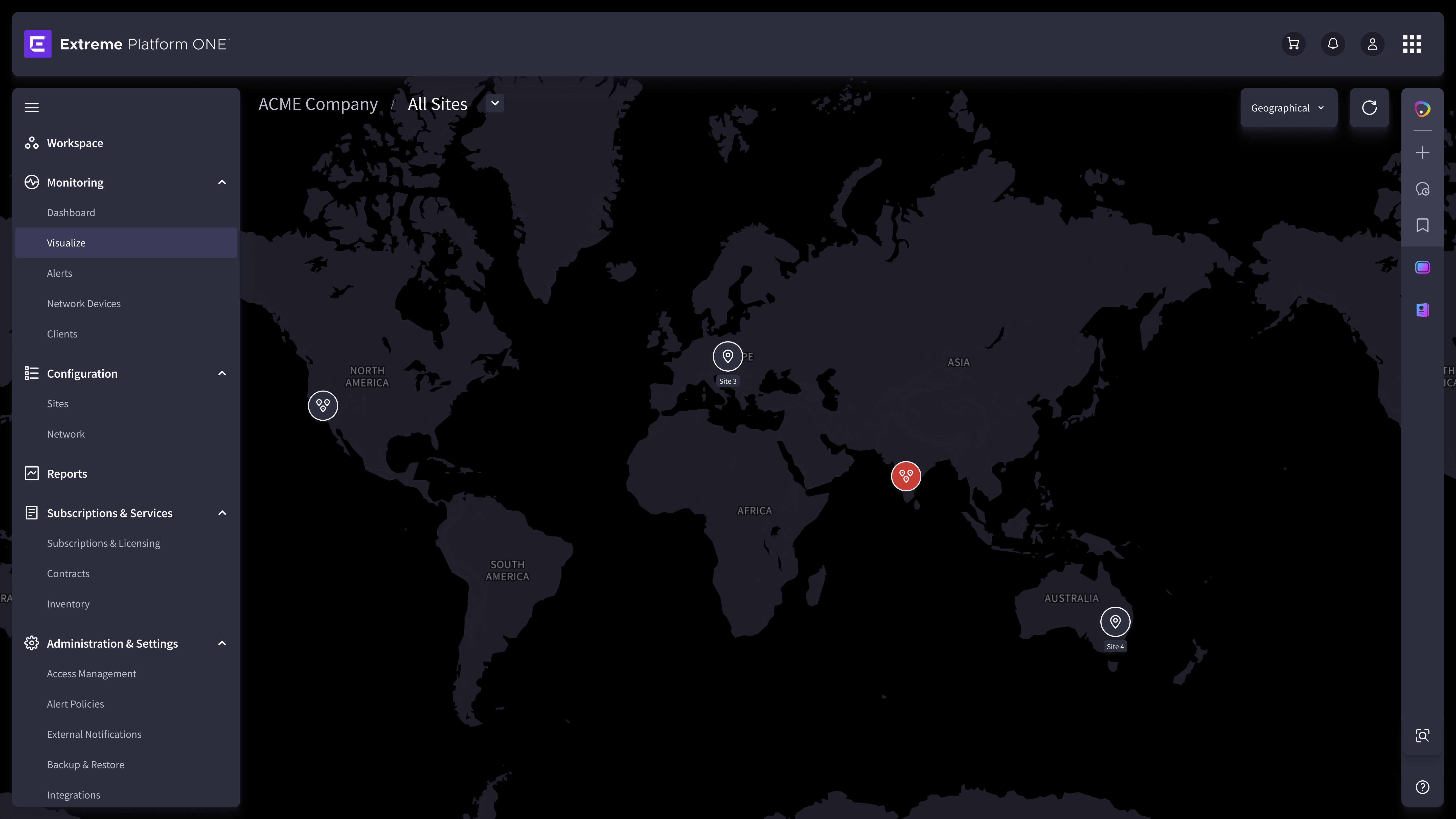
Geographical
Map-based. Where are my devices? Shows device location across sites, buildings, and regions.
Physical
Port-to-port connections. Which device is connected to which? Essential for tracing faults to a specific cable or switch port.
Access
Access layer topology. Which clients are on which access point? Critical for wireless and wired client troubleshooting.
Fabric
SPBM paths and fabric nodes. How is traffic routed through the fabric? For advanced engineers diagnosing fabric-layer failures.
Service / VLAN
VLANs mapped across devices. Which devices carry this service? Used for verifying service continuity and isolating faults.
Heat Map
Signal strength overlaid on physical space. Where is wireless coverage weak? For planning and gap diagnosis.
Constant container. Variable content.
The Design Decision — across all six views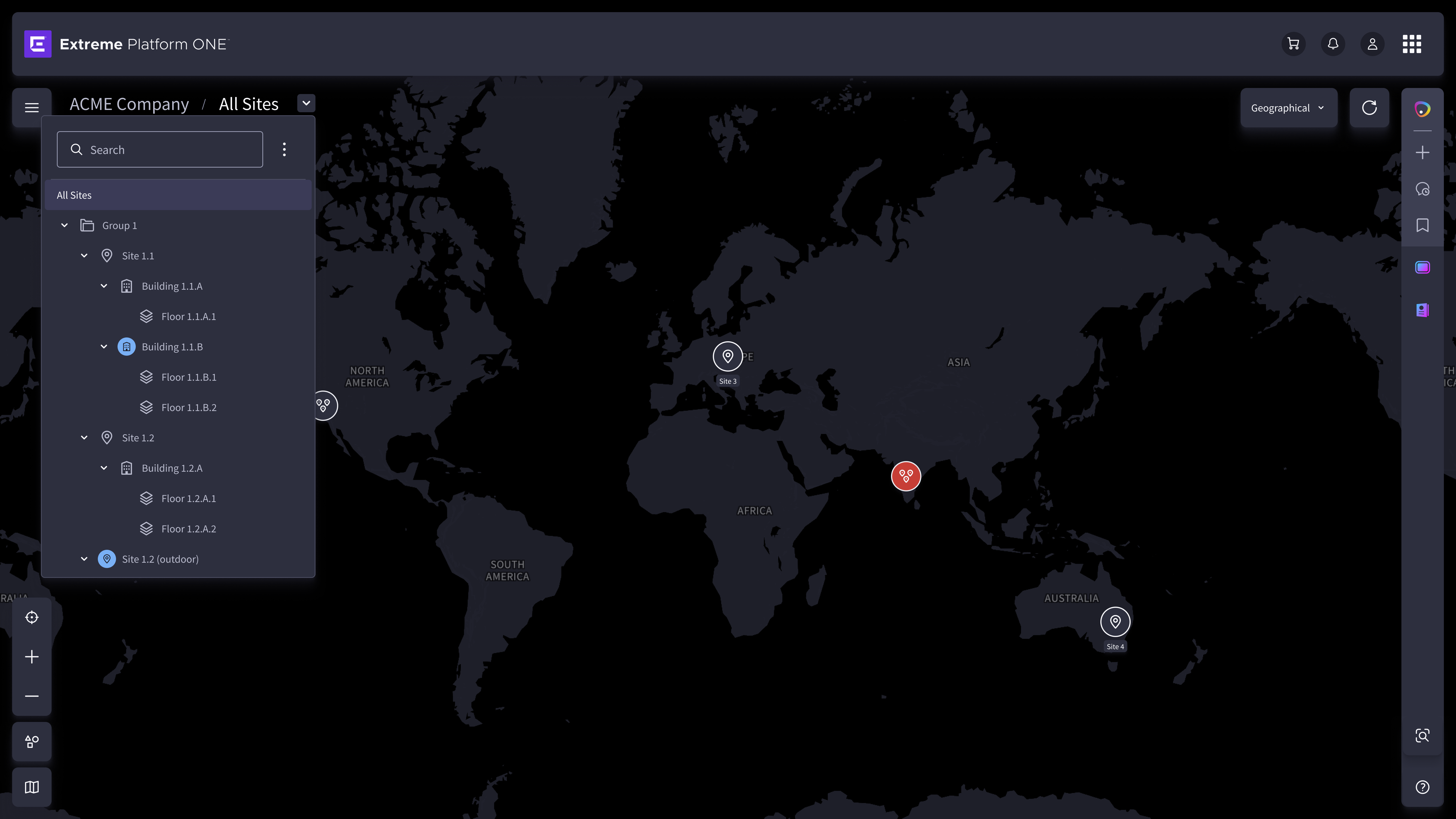
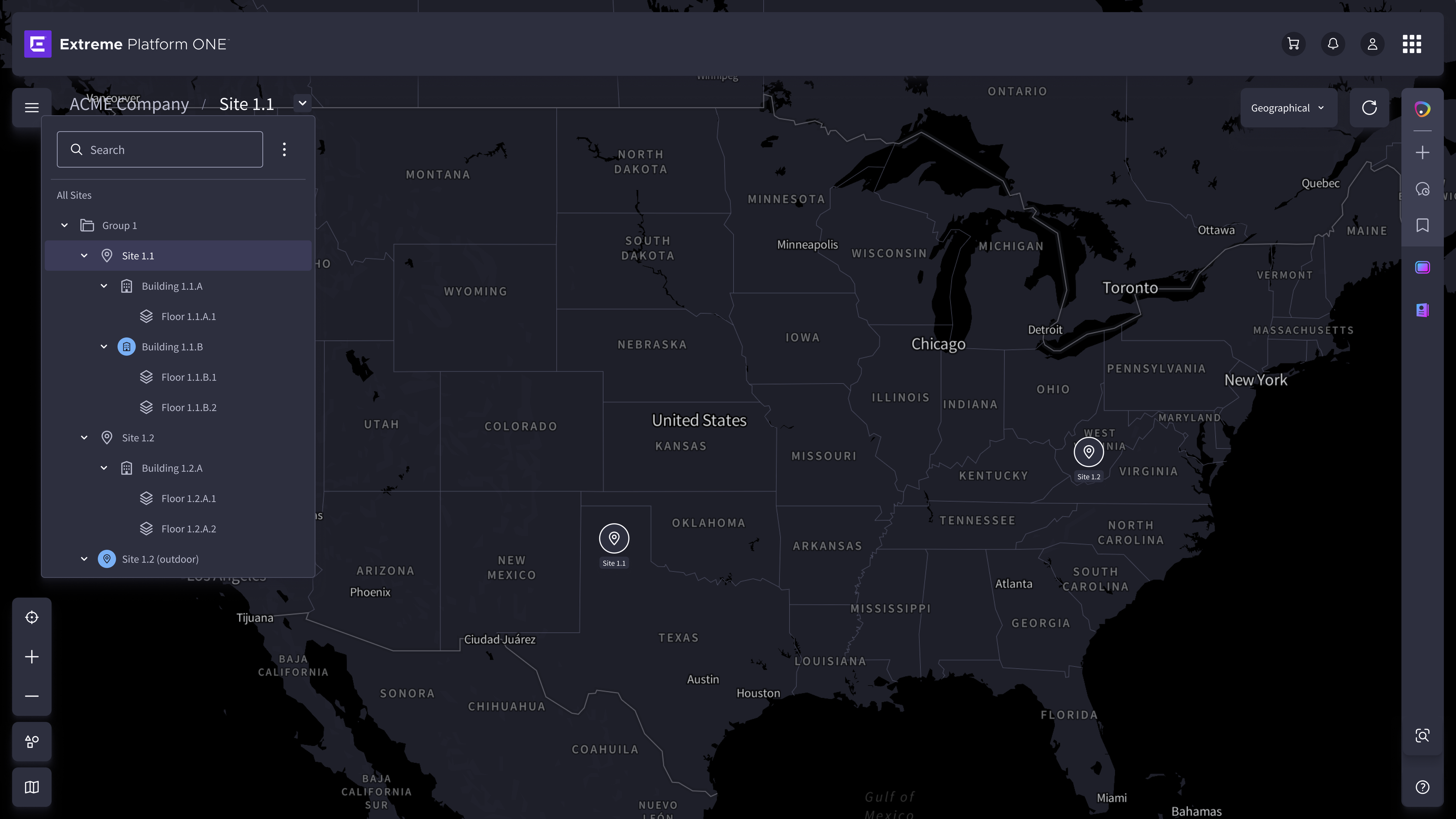
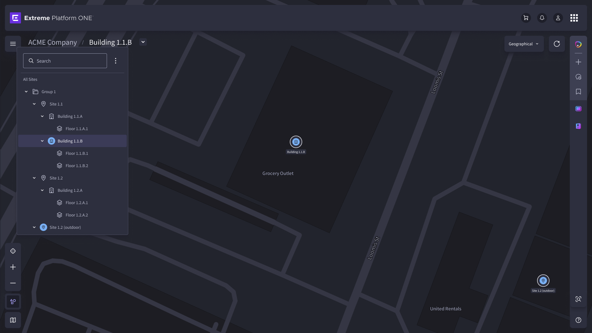
A network engineer switches between six topology lenses without disorientation, because the structural layer is constant, even as the visual content changes completely. The design works because it organized complexity into a structure expert users can learn once and rely on at any speed.
The Visualize module asked users to navigate complexity they already understood. The next challenge asked them to trust something they had no prior reason to.
Earning Trust Before
the First Interaction
How do you convince a skeptical expert to try an AI feature, before they've seen it work?
Workspace — Composable AI Dashboard
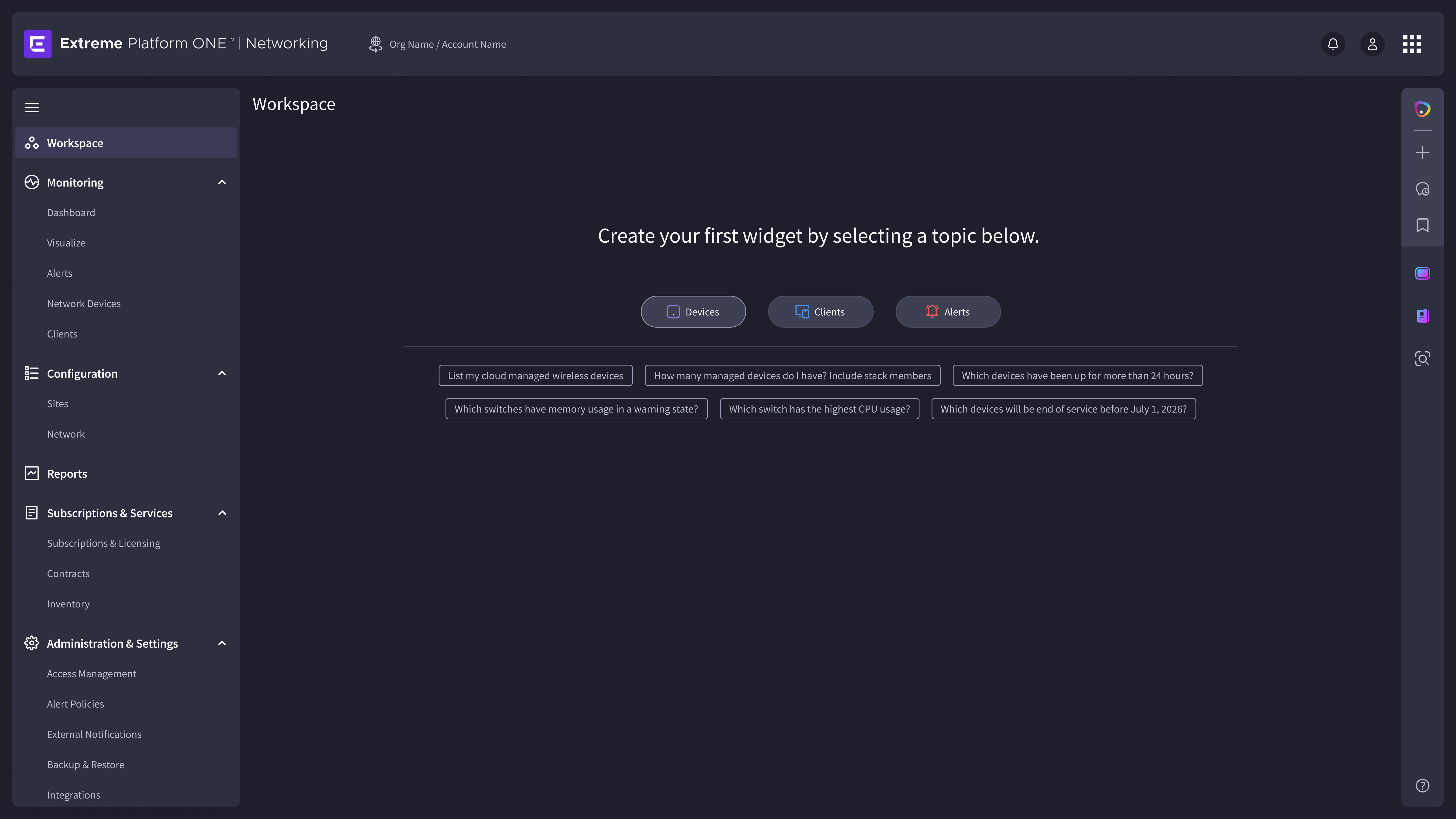
Enterprise IT professionals have been burned by AI features before. The design had to earn trust immediately, not ask for it in advance.
The Problem"Which switches have memory usage in a warning state?"
Devices"Which devices will be end of service before July 1, 2026?"
Lifecycle"List my cloud managed wireless devices"
Inventory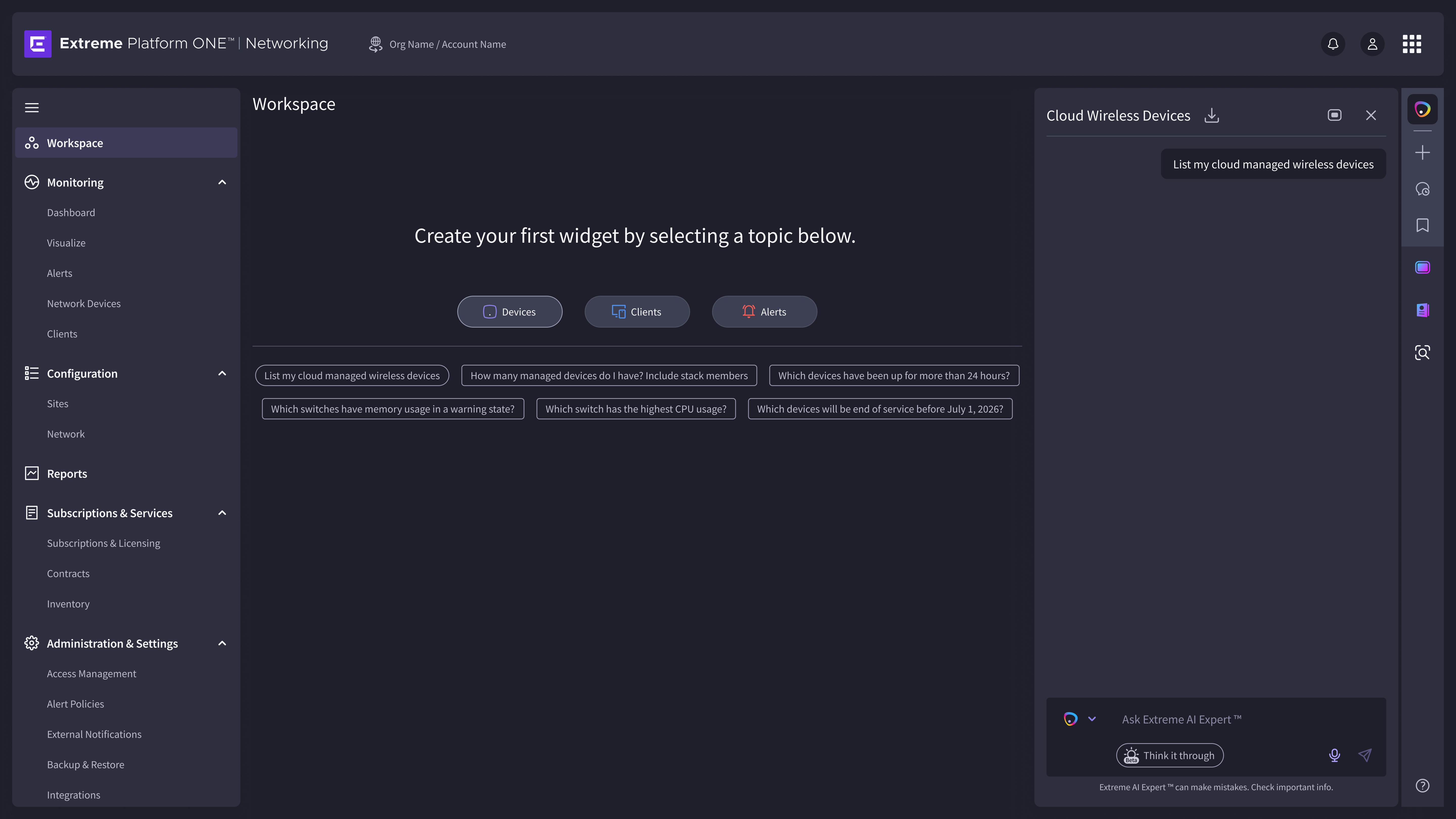
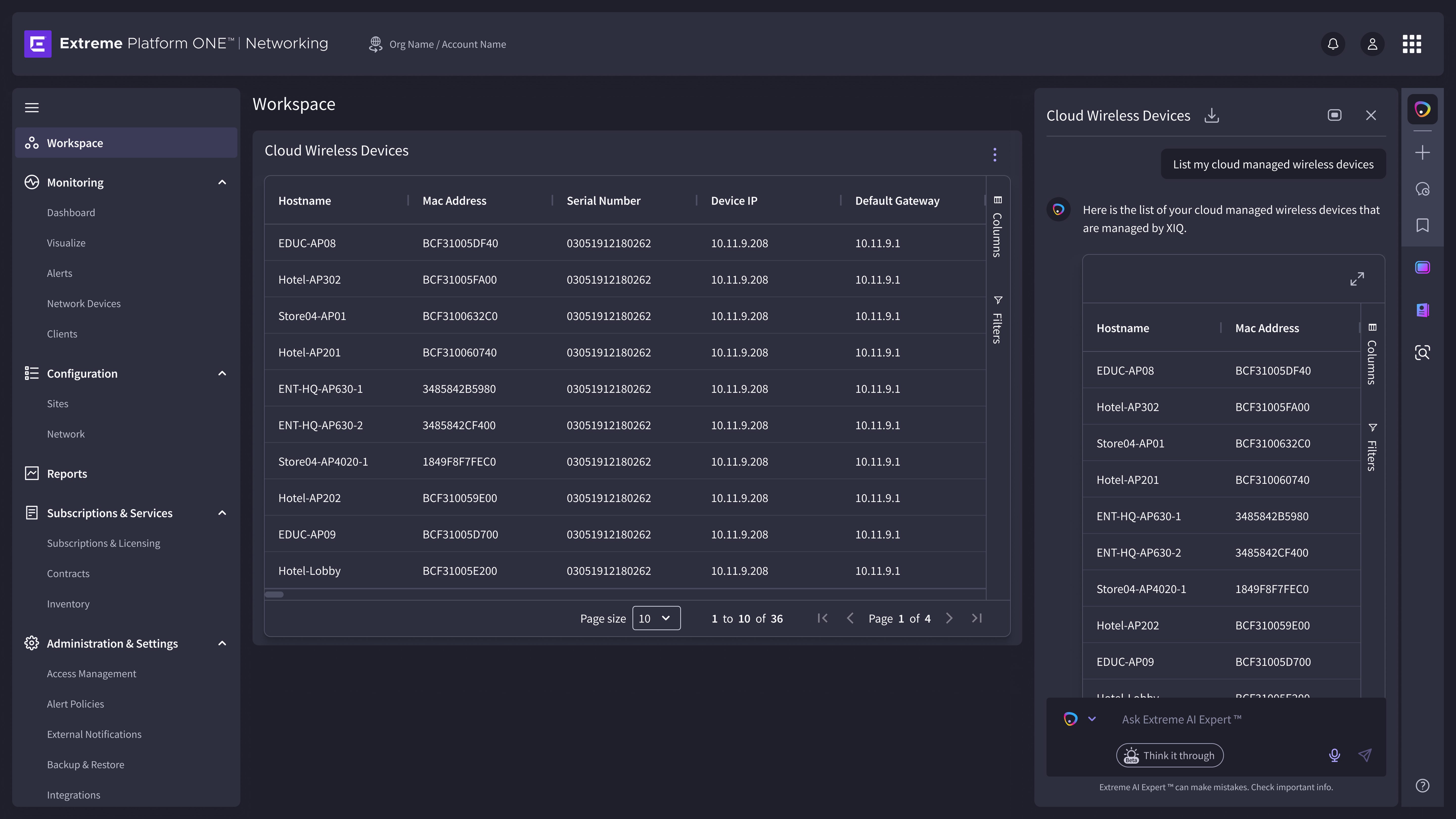
Trust isn't asked for. It's demonstrated, specifically, immediately, and then handed back to the user to decide what to do with.
The Design DecisionAn engineer arrives at an empty canvas and leaves with a functional, personalized operational dashboard, built through conversation, without manual configuration. The design earns trust not by overselling the AI, but by demonstrating it specifically and then giving the decision back to the user.
The Workspace required designing for one user building their own view. The next challenge required designing for a canvas that already holds everything: thousands of physical locations, each with its own devices, its own policies, its own administrators.
The Network
Beneath the Network
How do you make a hierarchy thousands of locations deep feel navigable, without asking the user to memorize the tree?
Sites + Site Management
Every device in the platform lives somewhere in a physical hierarchy: an organization, a region, a site, a building, a floor. Before you can manage a device, you have to be able to find it. Before you can find it, the hierarchy has to make sense at any depth.
The Problem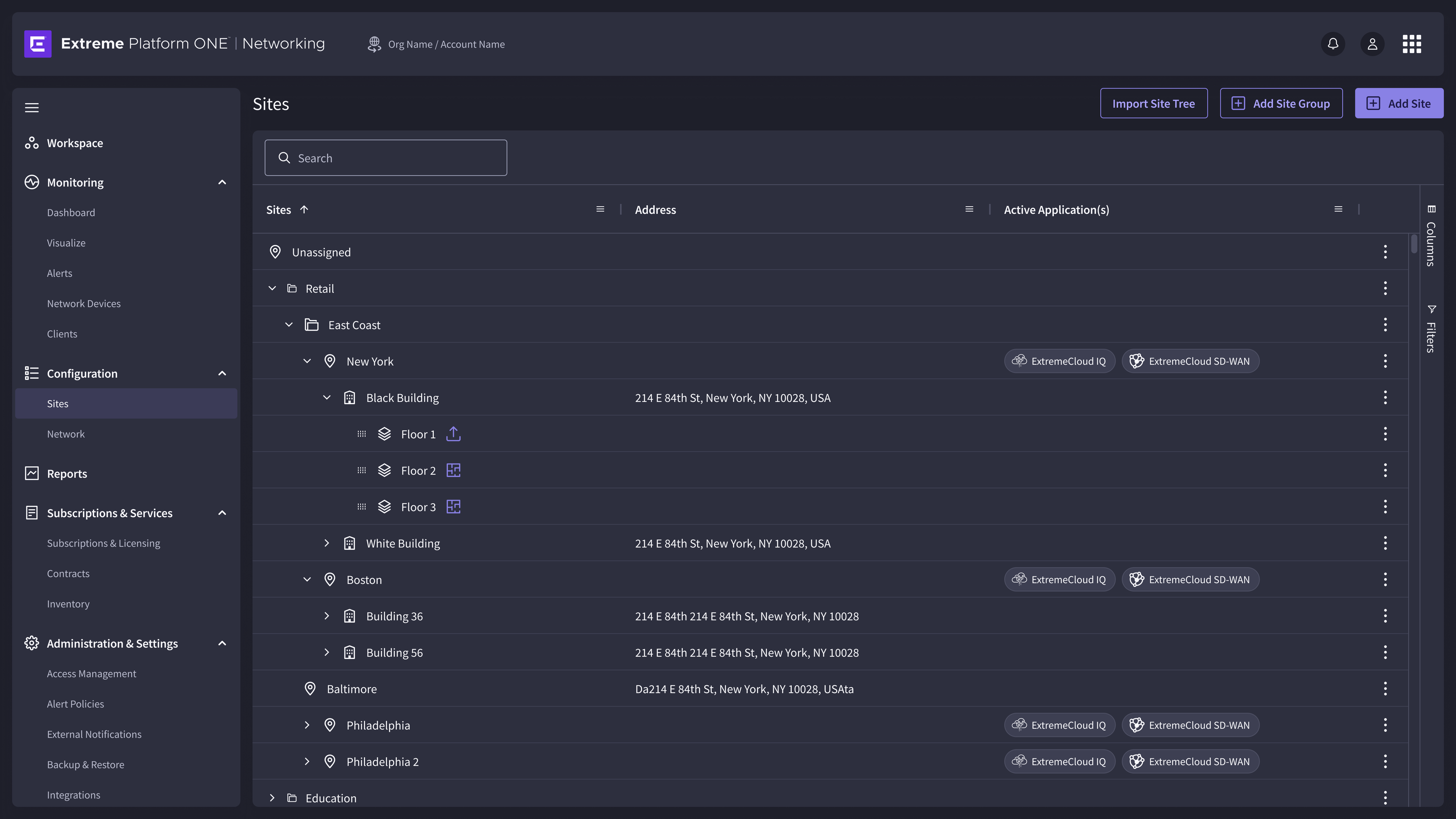
At ten sites, a tree is browsable. At ten thousand, it is a search problem. The design had to serve both, without building two different navigation systems.
The Design DecisionA network administrator locates any site in a hierarchy of thousands in a single interaction. Once inside, every site level workflow: device management, policy configuration, floor planning, is reachable without navigating away from the site's context. The hierarchy stopped being a maze and became a system with a clear entry point.
Sites defined the structure of the network. The next challenge was designing a surface that makes every device within that structure manageable, at any scale.
Ten Thousand Devices.
One Actionable View.
How do you design a data surface that scales from ten devices to ten thousand, without becoming a different product at each end of the range?
Network Devices + Inventory
A device table with ten rows is a quick reference. A device table with ten thousand is an operational system. The design challenge isn't adding more rows. It's deciding what information survives at scale, what recedes, and what requires a completely different interaction.
The Problem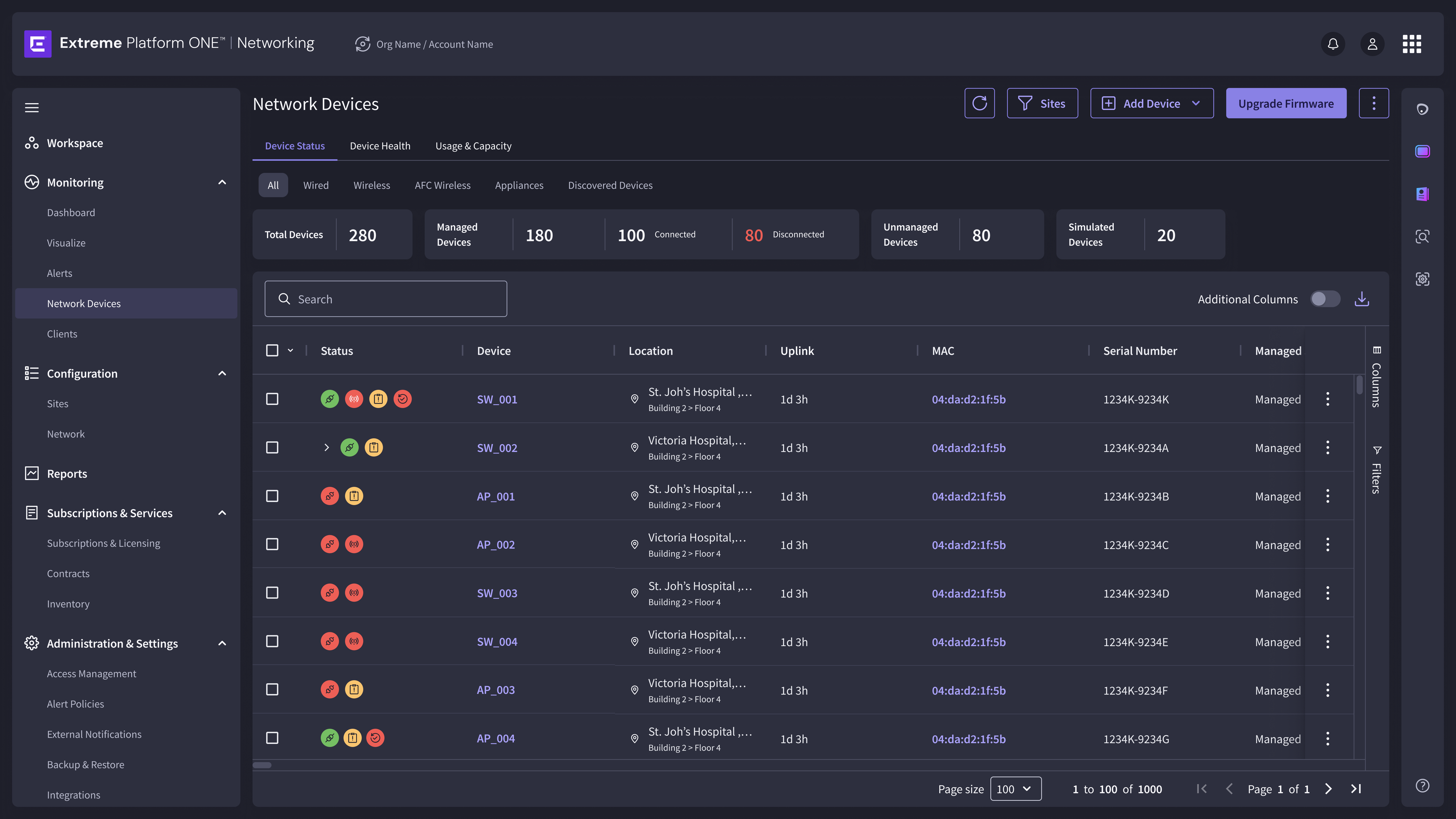
Column default selection
The columns visible by default are a design decision, not a data decision. They represent the highest-frequency questions an engineer asks on arrival: Is this device online? Where is it? What model? What software version?
Row-level status treatment
At ten thousand rows, a dedicated status column requires deliberate eye movement. Status communicated through row level visual treatment: color, icon, weight, lets an engineer scan vertically and locate problems without reading each cell.
Filter as primary navigation
When a table has ten thousand rows, filter is not a secondary feature. It is the primary interaction. Filtering by site, device type, software version, or status establishes a working set before any scrolling begins.

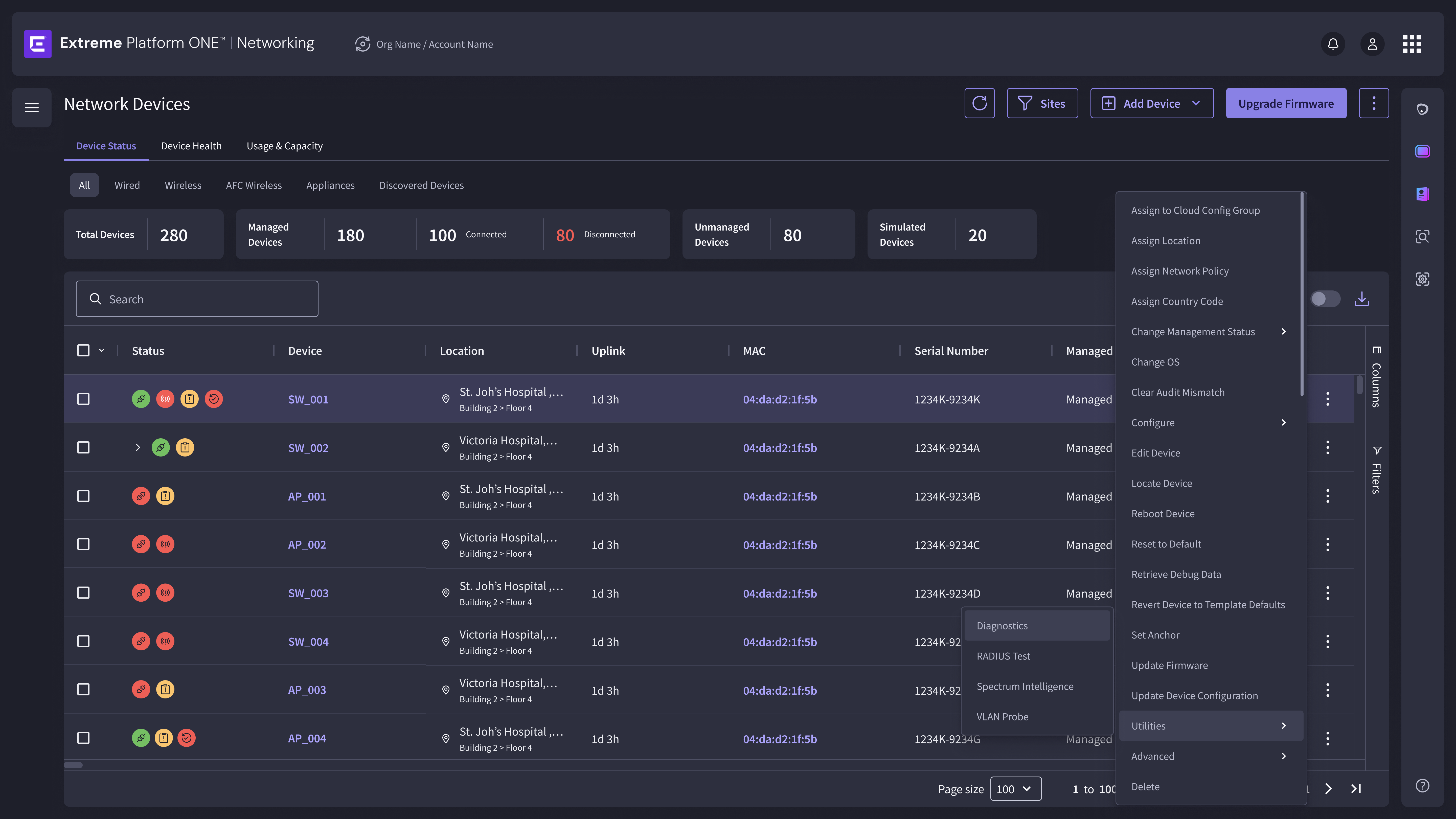
A network with 10,000 devices is not a bigger version of a network with 10. The design scales because the decisions about column priority, status communication, and filter architecture were made with ten thousand rows in mind, not ten.
The Design DecisionA network operations engineer opens the Devices table during an active incident and establishes situational awareness across thousands of devices in seconds, not by reading every row, but because the visual system resolved the information hierarchy before they started scrolling. The table works at scale because it was designed for scale from the first decision.
The Devices surface answered the question of what is happening right now. The next challenge was about what happened over time and how to turn that history into something actionable.
Turning Data
Into an Answer
How do you design a reporting surface that tells engineers what to act on, not just what happened?
Reports + Analytics
Enterprise reporting tools fail in a predictable way: they surface all the data and none of the meaning. The decision of what matters, and in what context, gets pushed onto the user. Designing Reports meant reclaiming that decision.
The Problem
Filters sit at the top and cascade across every chart simultaneously: Location, Date Range, Radio Bands, SSID. But each chart also carries a "Filter Applied" chip identifying exactly which dimension is scoping it. An engineer adjusting Radio Bands can see at a glance which charts are affected and which are not. This resolved a common reporting problem: users changing a filter and not knowing why one chart changed and another didn't.
Reports are rarely a one-time action. Network engineers review the same data weekly; operations teams send summaries to stakeholders. Rather than treating scheduling as a settings buried elsewhere, On-Demand Analytics, Scheduled Reports, and Recipients sit as first-class tabs, making the full lifecycle of a report accessible from one surface.
A network manager opens Reports to understand last month's performance and gets an answer in the first scroll. The supporting data is available for follow-up. The answer comes first. The design works because it made the decision the user came to understand, before they arrived.
Reports answered the question of what happened over time. The last challenge was different: not about understanding the past, but about responding to the present. Fast, correctly, and at scale.
When Everything
Is Critical,
Nothing Is
How do you design an alert feed that helps engineers triage, instead of one that logs everything equally and leaves the judgment to the user?
Alerts + Alert Policies — Unified Alert Management
A design decision made in Alert Policies directly shapes what every user sees in the feed and what reaches them outside the platform.
Enterprise monitoring generates noise by default. Every device, every threshold, every policy contributes to a feed that can reach hundreds of alerts daily. The design problem isn't surfacing alerts. It's making the right ones impossible to miss.
The Problem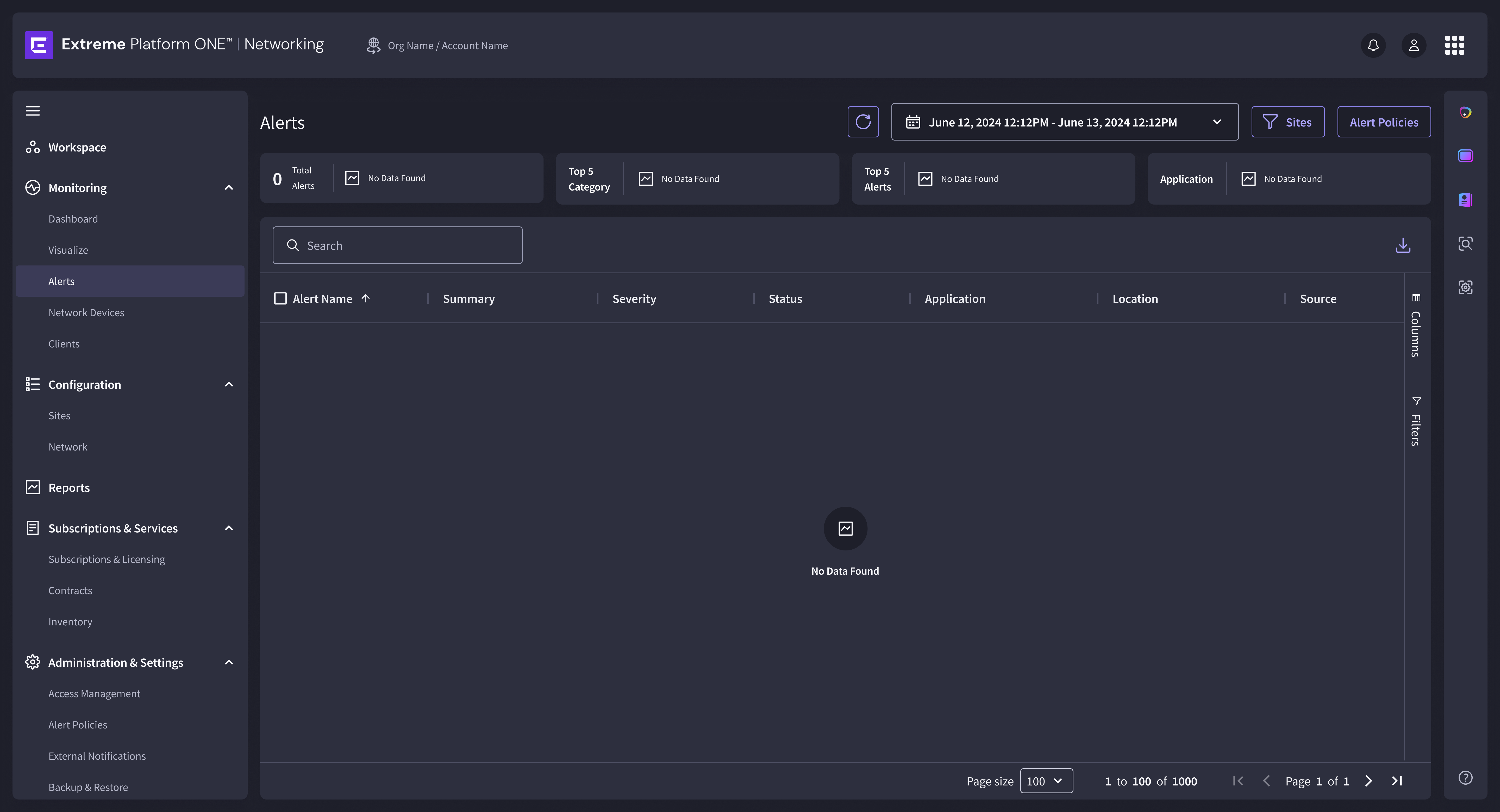
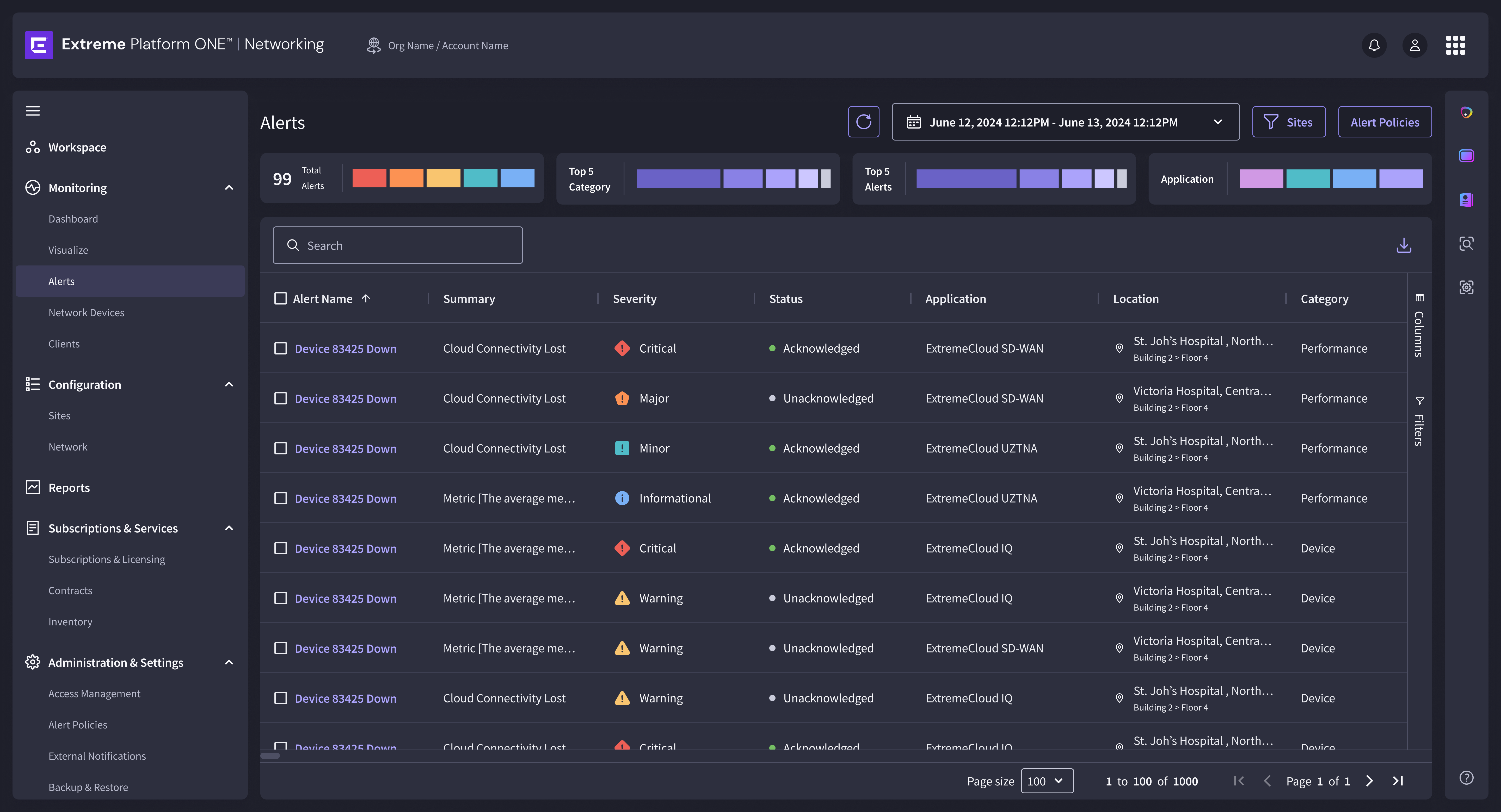
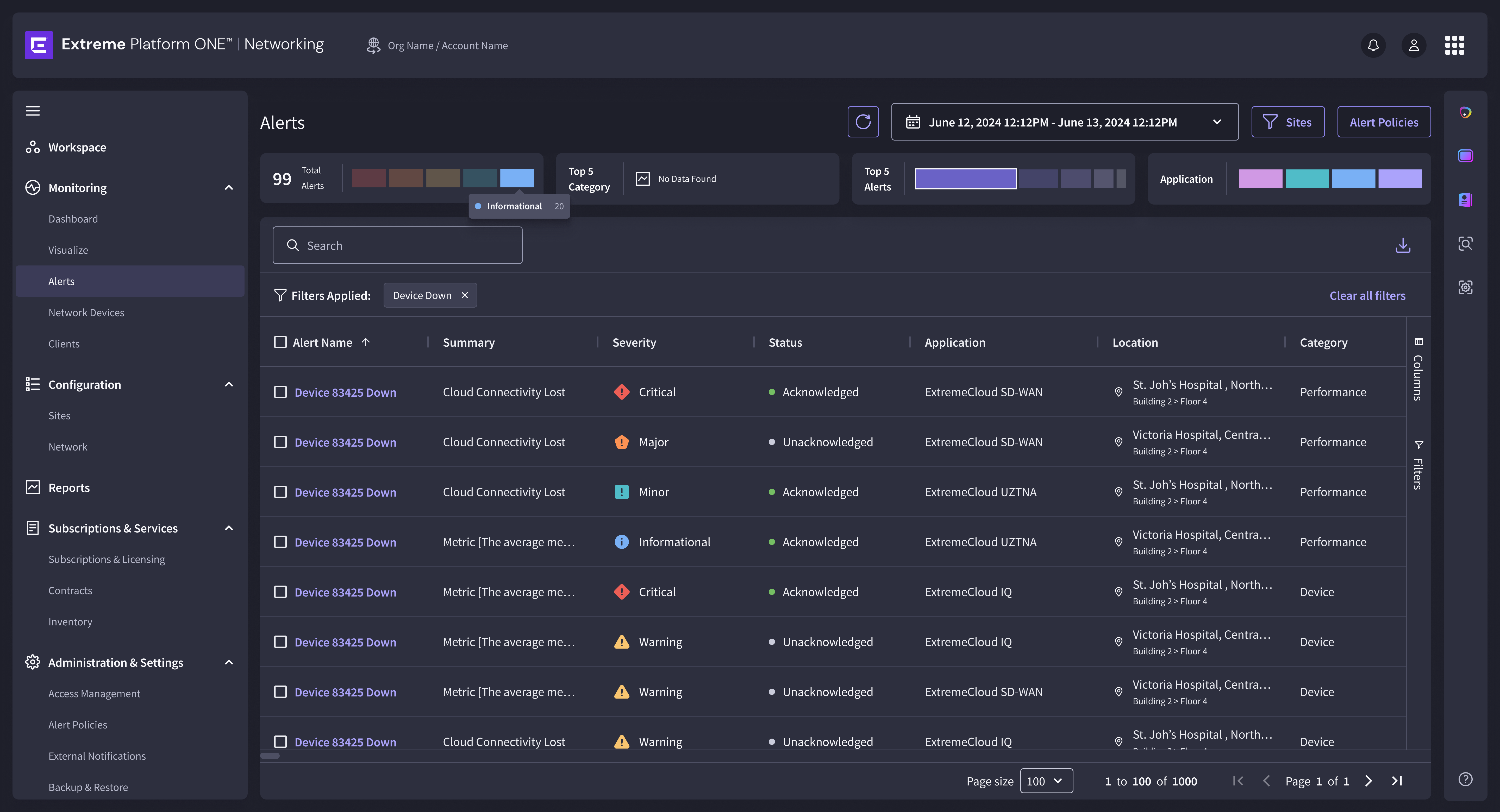
The feed cannot be designed independently of the policy that shapes it. A decision made in Alert Policies, what is Critical, what is Major, what is Minor, determines what every engineer sees when they arrive. Both layers had to be designed as one system.
The Design DecisionA network operations engineer establishes situational awareness in seconds, not because the feed is simple, but because the severity hierarchy was resolved before they arrived. The system operates as a coherent chain. Design decisions made in Alert Policies directly shape what every user sees in the feed. Both layers were designed with that chain in mind.
Six challenges. Six different surfaces. One pattern underneath all of them.
What Designing at
Platform Scale
Actually Requires
Look at the six challenges in sequence and a pattern emerges.
None of them can be solved well if you are only thinking about the screen in front of you. Designing at platform scale means designing anything with the awareness that everything is connected, and that a decision made without that awareness will create a problem three modules away that nobody predicted, because nobody was looking that far.
Process & Craft
Discovery
Meet with PM. Understand the business goal, user problem, and constraints before opening a design tool.
Exploration
Multiple low-fidelity directions evaluated against the requirement before any high-fidelity investment.
High-Fidelity
Complete workflows using the Extreme Design System: every edge case, error state, and empty state. Not just the happy path.
Formal Review
Two gates: ADS Review (components, spacing, patterns) and Content Review (terminology, voice). Both go back into the design before handoff.
Engineering Handoff
A live walkthrough, not a Figma link. Marked Development Ready only when engineering and PM are fully aligned.
Enterprise software has no A/B test for SSO setup. A configuration workflow ships, gets configured once, and isn't revisited for 18 months. If the design was wrong, the cost shows up in support tickets, IT time, and in security configurations, risk exposure.
The decisions I would revisit are the ones made under time pressure where the edge case was visible but deprioritized. The fallback rule in the IdP wizard was not originally required. It became required after considering what happens to users with unmapped groups, a scenario predictable in advance, easy to defer as "edge case." Most revisits share that shape: not wrong directions, but correct directions that stopped being followed through.
A design decision made with awareness of only the screen in front of you is always at risk of being correct locally and wrong systemically. Asking what a decision touches, before it's made, is the discipline that separates a competent enterprise designer from a good one.
The best thing about designing for expert users is that they cannot be fooled. They know their domain. They know what they need. They will find every gap, every ambiguity, every decision made without thinking it through.
That is not a challenge to work around. It is the sharpest design feedback loop that exists.
A year inside a platform this complex leaves something behind: not a completed artifact, but a different way of entering a design problem. What does this touch? Who else acts on this information? What does this surface look like at zero, at a hundred, at ten thousand?
Those questions do not belong to this product. They belong to the next one.